Wall design with different wallpapers. Combining wallpaper, wallpaper inserts and other ideas. Kitchen wall decoration
In this part, I will directly talk about the technology of gluing vinyl combined wallpaper on a non-woven base using a specific example. If anyone hasn’t read, then by combined I mean wallpaper from the same series, but in different colors. For a more detailed understanding of the process, I will give names to different rolls of wallpaper, as shown in the photo below:
The material in the article is quite voluminous, so if you are interested in specific points, then use the navigation menu:

1. Selection and preparation of glue
One of the most important aspects of the process of wallpapering walls is the choice of adhesive. Only high-quality glue will ensure the most reliable adhesion of wallpaper to the wall surface and will avoid problems in the future. At the moment, there are a huge number of types of wallpaper on the market, differing in their composition. There is a specialized adhesive for almost every type of wallpaper.
I used Quelyd adhesive designed for glass and non-woven wallpaper. This glue is a white powder that must be diluted in water. If you decide to use this glue, then detailed instructions on the proportions are indicated on the packaging. Also on the packaging you can find information about the pasting area for which the adhesive composition should be enough.
To prepare the glue you will need a small plastic bucket with a volume of about 5 liters. You need to fill the bucket with the calculated amount of water (see information on the packaging) corresponding to the amount of glue you are going to use. Next, you need to start mixing the water with a brush, creating a small whirlpool and at the same time carefully pour in the glue. The whole process must be carried out gradually, slowly, to avoid the formation of glue lumps. After preparing the glue, you need to let it sit for 15 minutes, then stir vigorously and get to work.
Important: do not dilute all the glue at once, prepare at least ¼ of it and try it. Firstly, it will be possible to adjust the consistency in the future, and secondly, you may simply not master all the glue, and it’s much more pleasant to work with fresh glue.
2. Where should you start gluing wallpaper?
This question is asked by everyone who is faced with wallpapering for the first time. Previously, in Soviet times, paper wallpaper was widely used, which was glued overlapping; it was necessary to start pasting the walls from the window, in which case the joints between the wallpaper were least noticeable in natural light.
Nowadays the vast majority of wallpaper is glued end to end. Therefore, you should choose the starting point for pasting based on the following considerations:
- Convenience. For example, it is more convenient for me to glue wallpaper, moving from left to right, that is, joining and aligning the left edge of the strip;
- Wallpaper consumption. Before you start pasting, you need to figure out how you can reduce consumption and rationally use wallpaper scraps;
- Individual characteristics. In the example given in this article, I start gluing from the corner of the room, since this is the only way to ensure an even and neat joint of the combined wallpaper;
3. Technology for gluing wallpaper on a non-woven basis
I would like to highlight general points that will help you understand the principle of wallpapering walls with non-woven wallpaper:
- Wallpaper strips are cut depending on the height of the wall and the margin for adjustment. For example, if the wallpaper is monotonous (without adjustment), then we only need to take into account the height of the wall and the margin for trimming at the ceiling and floor (no more than 10 cm), and if the wallpaper has a pattern that requires adjustment, then accordingly we need to take into account the height of the wall, and a margin for fitting, and a margin for trimming. The margin for adjustment depends on the vertical pitch of the pattern;
If you are afraid that you may incorrectly calculate the length of the strip required for fitting, then cut the wallpaper in place. That is, you need to glue the first strip, then unroll the roll, match the pattern on the roll with the already glued strip, make a mark and cut off the strip of wallpaper
- Wallpaper glue applied to the wall apply a roller to an area slightly larger than the width of the wallpaper strip; it is more convenient to coat the corners with a brush;
- Wallpaper strips are glued end to end. The strip of wallpaper begins to be glued from top to bottom, slightly leading to the ceiling, and at the same time it is aligned either along a vertical drawn line (if this is the first strip on the wall) or along the edge of the already pasted strip of wallpaper;
- Then the wallpaper strip is smoothed out; air bubbles and excess glue must be expelled. Movements must be made from the center of the strip to its edges. For smoothing, use a plastic spatula, a dry, clean cloth or a wallpaper brush;
- The glue protruding from the wallpaper joint must be removed with a damp, clean cloth;
- The wallpaper joint must be carefully ironed; a special roller is used for this, but you can also use a plastic spatula;
- Excess wallpaper on top and bottom is trimmed with a utility knife using a metal spatula.
4. How to match wallpaper of different colors in the corner of a room?
This is one of the first questions that arises when covering walls with wallpaper of different colors. We will try to analyze it in as much detail as possible.
The method of joining wallpaper discussed below is called “trimming” or “trimming” the wallpaper in the corner.
The essence of the method is that the wallpaper is glued with a slight overlap, then a cut is made along this overlap, respectively, through two layers of wallpaper at once, the excess wallpaper is removed, and the joint is smoothed.
In my case, wallpapers of different colors are joined, so the boundary between the canvases should pass strictly along the corner of the room, and accordingly the cut is made along the corner, but if strict separation of the wallpaper in the corner is not required, then it is better to make the cut on one of the walls, stepping back a small distance from the corner (5-15 mm), this way the joint will be smoother.
An example of wallpaper joining in the corner of a room:
Step 1. We need to draw two vertical lines on adjacent walls; this is done with a simple pencil. Since the width of the roll (in my case) is 53 cm, and the overlap needs to be about 5 cm, then you need to step back about 48 cm from the corner of the wall, in one direction or the other, and draw vertical lines using a building level or plumb line.

Step 2. Then we need to apply glue within these lines. We take a roller and a tray of glue and carefully apply the glue to the wall, coating hard-to-reach places (corners) with a brush.

Step 3. We take a strip of patterned wallpaper and carefully glue it from top to bottom, smoothing out any unevenness with a special plastic spatula, or you can also use a clean cloth or wallpaper brush.

In the photo below we see that the wallpaper is glued with an overlap on the adjacent wall within 5 cm:


Step 4. We cut off excess wallpaper that extends onto the floor or ceiling using a metal spatula.
Step 6. Carefully smooth out the wallpaper in the corner:


1. It is very important that the knife is sharp, then the joint will be neat and even.
2. It is much more convenient to make a cut with two people: one holds the spatula, the other cuts.
Step 8. Removing cut strips of wallpaper:

In my case, the “patterned” wallpaper was underneath the “green” wallpaper, so I peel back the wallpaper a little (photo above) and pull out a cut strip of “patterned” wallpaper:

Step 9. The wall under the folded wallpaper must be coated with glue using a brush, and then the wallpaper must be pressed tightly against the wall:

Step 10. Smooth out the wallpaper at the joint with a plastic spatula. The wallpaper joint in the corner is ready:


If you use plain or striped wallpaper, then it is more correct to make the joint not in the very corner of the room, but on the wall, 10-20 mm away from the corner, this way it is easier to make a neat cut and the seam will be smooth
5. Wallpapering around switches and sockets
If the socket and switch have not yet been installed, then steps 1 and 2 can be skipped:
- De-energize the switch or socket, and then carefully remove it from the socket and disconnect the wire;
- Hide the wire in the socket so that it does not interfere with the pasting, having previously insulated it;
- Paste a piece of wallpaper over the hole for the switch or socket;
- Take a utility knife and make a circular cut along the outline of the hole;
- Carefully smooth out the wallpaper with a plastic spatula next to the hole.


6. Pasting the room with combined wallpaper. Main stages.
After making the joint in the corner, you choose which direction to move. I started covering the wall with “green” wallpaper. Having almost completely covered this wall, I left space only for the outer strip, since it needs to be joined through the slot with the “white” wallpaper.
Then I returned to corner No. 1 and began to move towards the window, covering the wall with “patterned” wallpaper:

Then, in corner No. 2, I joined the “patterned” wallpaper with the “white” wallpaper using the same technology that was presented above, that is, through a slot. The docking process is shown in the photo:
I left the wall with the window for last, since it was necessary to replace the radiator and paint the heating riser. I moved to a long wall with “white” wallpaper (item No. 17 according to the diagram), again drew a vertical line along the level and began to paste the wall from left to right.
In corner No. 4 I made a junction of “white” wallpaper with “green” wallpaper (photo below):

Lastly, as mentioned above, I tackled the wall with the window.
The main task when covering this wall was to join the wallpaper through the cut above and below the window. The point is that due to the window opening, the height of the joint in this case will be minimal, and the joint located under the window can be hidden under the heating radiator. Therefore, the pasting diagram shows that the movement when pasting wallpaper is carried out from the corners to the center of the wall. Strips 33 and 35, as well as 30 and 32 are joined through a slot. The pasting process is clearly shown in the photo below:

Pasting two types of wallpaper is a fairly common way to decorate surfaces in residential premises lately. Using this method, you can create a unique designer interior, create an accent, visually increase the height of the walls and expand the space. Before hanging two types of wallpaper, it is recommended to learn about the basic rules for combining them.
Pasting walls with different wallpapers should be carried out strictly according to the rules. To make the combination look as harmonious as possible, you need to take into account a number of factors before starting work.
Ceiling height
It is on this characteristic of the room that the final choice of material, its pattern, texture and shade depends.

Room dimensions
If the room area is large, then you can safely use dark-colored materials and their combinations. Saturated shades are also suitable; they will visually reduce the size of the room, but in spacious rooms this will not be as noticeable as in small ones. You shouldn’t settle for ordinary plain products; it’s better to cover the room with dark materials with large, light patterns. Very often, for covering two types of wallpaper, products without a pattern and materials with images of foliage, bamboo trunks and other plant motifs are used.
As for small rooms, you cannot visually reduce the space, so dark colors will not work; it is better to use light-colored products with a small pattern. A small repeating pattern will look great.
It is also important to consider the geometry of the room. If the room is long and narrow, for example a corridor, then it is better to cover the short walls with light-colored wallpaper with a slight overlap at the corner, and the long walls with darker or more colorful ones, if the planned design of the walls allows. This visually smoothes out the difference in surface sizes.
When the entrance to a narrow room is located on one of the long walls, the following type of wallpapering is perfect: you need to choose a color for short surfaces, and use several stripes of a more saturated color for the middle of a long wall. The corners of the room should be sealed to match the short walls.
 Design option for a narrow room
 Material texture
Now let's look at how to combine two types of wallpaper depending on the thickness and texture of the product:
- The main rule is to use materials of the same thickness. It is best to choose products made on the same basis. That is, paper with paper, non-woven with non-woven and so on. There are other options for covering walls with different wallpapers, but they require careful selection. As for colors, there are no strict rules; it is recommended to place samples on one surface before purchasing and look at the resulting combination.
- Things are more complicated with texture. If you plan to join the strips only in the corners, then you don’t have to worry too much about the difference in thickness or texture. The fact is that in such a place it is quite difficult to notice the transition if it is small. But if you plan to connect products in the middle of the wall, then it is better to either use materials with the same texture and different colors, or cover the joints with baseboards and other products.
 Combining products of different textures will require hiding the joints using molding
 It is necessary to take into account the features of applying each type of wallpaper. If you decide to combine paper and non-woven roll materials, it is important to buy special glue for each. You can purchase a universal composition, but for the best effect it is recommended to use different ones.
Technology is also important: in the case of paper wallpaper, glue is applied both to the wall and to the product; non-woven wallpaper does not require processing of the reverse side.
Room lighting
How can you use lighting beautifully? If the room is almost always well lit by the sun, then it is not necessary to artificially darken it by covering all surfaces with dark wallpaper. It is better to stick light-colored products on 3 walls, and the last one, which is opposite the window, with darker ones. As a result, the pasted wallpaper will not look monotonous and will not darken the room too much. This technology also works in the opposite direction: in dark rooms you can stick a wide strip of light wallpaper on one of the walls and thus lighten the interior a little.

Combination of different types of materials
The modern market offers a huge number of different types of wallpaper that can be used in combination with each other. Below are the best compatible wallpaper options:
- Paper. This classic variety is perfect for combination with almost any look. They are easy to trim, so you can use paper models to create colored inserts or accents.
- Vinyl. The ideal combination is ordinary vinyl products with photo wallpapers. They can also be combined with multi-layer paper materials so that there is one thickness.
- Non-woven. They go well with all types, except textile ones.
- Liquid. It is best used in conjunction with vinyl or non-woven options. Since liquid wallpaper is a wet material similar to plaster, combination with paper wallpaper is not recommended.
- Textile. It is better not to combine this type of wallpaper. There are a huge number of fabric-based models, it’s worth focusing on a few of them.
Options for combining materials on surfaces
If you have a question about how to beautifully hang two types of wallpaper, it is recommended to pay attention to one of the following options. These methods are considered classic and have been used more than once for interior decoration.
Vertical stripes
In this case, materials with different patterns are pasted onto the walls alternately. This wallpapering design helps to visually increase the height of the walls. It is important that the glued products have the same texture, since the play of shades will attract attention. In addition, using the same wallpaper, you can beautifully join them without any difference in the seams.

Horizontal stripes
This combination is perfect for visually expanding space. This method is ideal for rooms with high ceilings where there is no need to increase the height of the walls. To wallpaper walls, you need to divide the surfaces into two parts: first glue the top strip of one color, and then the bottom strip of a different shade. To do this, you can buy products with any texture and ornament. The main thing is that they fit well together.
 Horizontal division of walls is best suited for rooms with high ceilings
Inserts
The options for gluing the two types of wallpaper with inserts are also different.
This idea is perfect when you want to make an accent in the interior:
- First, markings are applied to the wall, taking into account the location of the colored inserts. For ease of pasting, it is better to draw rectangles or squares.
- Then you need to prepare the wallpaper itself. Plain material is trimmed so that it does not cover the figures painted on the wall.
- The main wallpaper is glued first.
- After this, products of other colors are cut out according to the given dimensions and the resulting gaps are sealed with them. If wallpaper with different textures is used, it is necessary to seal the joints with moldings.
- This way the entire wall is covered.

There are other ideas for wallpapering using inserts:
- A large section of the wall covered with photo wallpaper is the basis of the composition; it is marked and processed first. From it you can already glue ordinary vinyl or non-woven wallpaper, the color of which will match the color scheme of the pattern. For example, if in the center there is an image of a green forest, then the sides should have wallpaper in green or brown tones.
- There is also a patchwork technique. Here the products are cut into small fragments of approximately the same shape, after which they are glued to the base according to the applied markings. You can paste the fragments in a certain order or randomly.
 Wall decoration using patchwork technique
 Other techniques
You can also use one of the following ideas:
- Contrast of walls and ceiling. Suitable only if the ceiling height is more than 2.5 m. In this case, it is recommended to make the ceiling darker or lighter than the walls. You can also use a gradient: the bottom of the wall is dark, the top is slightly lighter and the lightest is the ceiling.
- Finishing corners. The main area should be covered with light wallpaper, and darker shades should be used in the corners. This technique allows you to visually expand the room, but it can only be used if the design does not require strict rules for color combinations. This option is perfect for rooms with corner furniture, then the emphasis will be on this part of the wall.
- Isolation of surface relief. If there are any protrusions or niches in the room being treated, you can focus on them. For example, cover the main area with plain dark wallpaper, and the protruding fragments with lighter wallpaper. Or vice versa, but this option is not the most popular.
 Highlighting a niche using wallpaper of a different color
 Basic rules
To hang two types of wallpaper, strict adherence to certain rules is required:
- Color solutions need to be implemented not only in wallpaper combinations, but also in furniture, curtains, various items and accessories. This way the interior will look more harmonious.
- The combination of plain materials and products with ornaments is considered one of the most successful.
- It is not recommended to use combinations of variegated tones. It is better that one stripe is bright, and the second is a more muted shade.
- If the main material has a floral pattern, then a combination with wallpaper, the texture of which is made in the same style, would be an excellent solution.
- Products with geometric shapes are recommended to be combined with abstraction.
- When using materials with different textures, it is necessary to mask the joints using moldings, slats, tapes and borders.
- Triple combination is possible only in the case of large rooms; in small rooms the interior will look too bulky.
- Both glue and wallpaper need to be bought in the same store, it is better if they are from the same manufacturer.
- Preliminary marking is required.
- It is recommended to start pasting from the top.
- When applying products, it is important to leave a reserve in case they move away after drying.
The combination of two types of wallpaper with different patterns, textures and colors allows you to create a truly original interior. It’s just important not to rush and first check how good this or that combination will look on the walls.
Modern wallpapering designs use different color and texture combinations, combinations of patterns and designs. Creating an interesting design is not difficult if you know about the current trends in interior design.
Main trends
Color solutions
Bright colors and pastel shades are in fashion. Light-colored wallpaper allows you to expand the spatial boundaries of rooms, is an excellent backdrop for creating accents, and gives the room additional illumination. Green, blue, light blue, turquoise and brown colors are considered stylish in modern design. Contrasting and monochrome combinations are popular; colored “spots” are often used in decoration. These ideas look impressive in the photo below:
Drawings and patterns
Modern design gravitates towards patterns and patterns of different colors. The mediums of popular prints are ancient Greek (meander), animal (zebra, Dalmatian, leopard), geometric (stripes, rhombuses, checks, squares), plant (flowers, trees), printing (antique inscriptions). The photo shows wall pasting with geometric patterns.

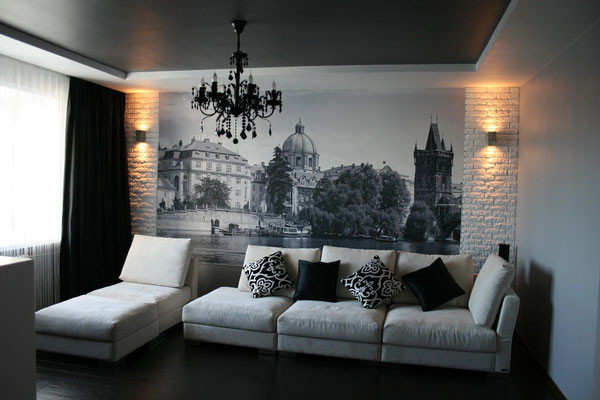
Photo wallpaper
Photo wallpapers are used in the interior to decorate a separate wall or area to attract attention. The themes of this type of wall covering are varied: natural (images of mountains, waterfalls, flowers), urban, cosmic. Take a look at how these ideas are implemented in design.
Textured wallpaper
Embossed surfaces in combination with plain coatings look luxurious and rich; they are most often used to highlight an accent wall in the living room. Among this kind of paintings, textured wallpapers for painting and fabrics imitating wood, stone, and brick are distinguished. See how it looks in the interior in the photo.

Combining wallpaper
The most popular methods for gluing combined wallpaper are:
- vertical zoning;
- wallpaper inserts;
- highlighting an accent wall;
- design of niches, ledges;
- pasting with flaps.
What does a combination of different types of wallpaper look like in an interior?

How to organize space in the living room
All types of wallpaper combinations can be used in decorating the hall. Two-color horizontal design is popular. The design uses coatings of different textures and shades.
To increase the area in the room, you should choose discreet patterns; large patterns visually reduce the space. For decorating small rooms, a great option is to use small patterns on the walls. Take a look at the photo:

You can raise the ceiling using vertical stripes. Ideas for vertical zoning of space:
Symmetrical pasting used for elongated rooms. Look at the photo.

Central wallpapering in wide stripes, contrasting in color with the wallpapering of the end sections.
Asymmetrical pasting with narrow stripes in one part of the room, wide ones in the other. Look at the photo.

Horizontal zoning, on the contrary, helps to visually reduce the height of the walls and expands the spatial boundaries of the hall. Horizontal distribution is most often used to decorate narrow rooms. Diamonds and squares give the same effect. Take a look at the photo.

Other ideas for decorating the hall
To create contrast in the living room, you can highlight one wall with a large pattern or original ornament. It looks interesting to highlight the surface with strips of gypsum or polyurethane. See what an accent wall looks like in a hall design.

Use colorful patterns to decorate beams, niches, and ledges. You can disguise or highlight some part of the room using patchwork. See what modern patchwork looks like in the photo.

An interesting idea for wallpapering a living room is to decorate it with relief canvases with images of stains, drops, and abrasions. It looks original and lively, and also hides the imperfections of the walls. Curly inserts are often separated from each other by moldings. Look at the photo to see what this idea of wallpapering in the living room looks like.

Interesting ideas for wallpapering in the bedroom
In the bedroom it is customary to use a minimum of decorative elements so as not to clutter the space. Therefore, to decorate bedrooms, plain wallpaper in light colors is most often used.
To add variety, we offer several ideas for covering walls. You can add dynamics to the interior using contrasting patterns. Bright wallpaper would be appropriate on the wall near the sleeping area; it will add brightness and create interesting accents. For pasting, you can use photo wallpaper.

Symmetrical segments, decorated with wallpaper in active colors and moldings, do not overload the interior and give it a special charm.

Against the background of light wallpaper, a bright palette of bedside niches will look good. Colorful elements will add dynamism to the bedroom and refresh the room. See how this wallpapering idea comes to life in the bedroom.
How to decorate a bedroom in a modern way
Interesting options for covering the sleeping area.
Dark mint wallpaper with golden embossing will create a royal interior. Accessories for such a room would be brocade curtains and a gilded chandelier.
Wallpaper with a metallic sheen looks harmonious with leather upholstery and dark curtains.

The small ribbed pattern on the canvases in the bedroom goes well with the light furniture ensemble.

Dark gray textile fabrics with silk embossing will create coziness and comfort in the sleeping area.
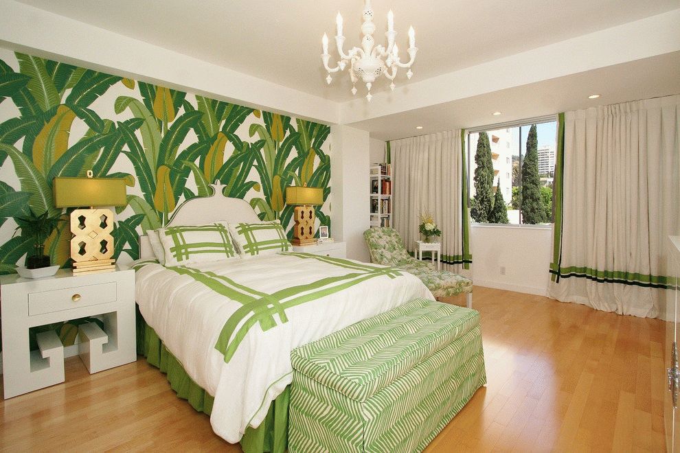
One of the trends in modern bedroom design is the combination of white and green.

Interesting solutions for kitchen wallpaper
In the decoration of the kitchen, an important role is played by the combination of wallpaper with furniture, textiles, ceiling and floor decoration, as well as kitchen accessories. To create a traditional setting, neutral natural shades and discreet colors are used.
A bright floral print is used to cover accent walls. A floral or floral pattern is essential to freshen up a room. This interior will be complemented by glass chandeliers or curtains with repeating motifs. Canvases with large daisies will add a touch of frivolity to the kitchen. The floral print with tree trunks looks interesting. See how this idea is implemented in the design in the following photo.

Geometric patterns in squares and stripes give the kitchen coziness and comfort; the meaning of strict lines in the interior depends on the style of the room.

Textile wallpaper with embossing goes well with dark wood and chrome surfaces of household appliances. Purple canvases of this format are perfect for snow-white furniture.

Photo wallpaper in the kitchen is a great idea for creating a bright and dynamic interior. Most often, natural-themed drawings (images of forests, rivers) are used in decoration. The floor and ceiling in such rooms should be made of natural materials. It is better to furnish such a kitchen with wooden furniture. What does wallpapering like this look like in a kitchen interior?

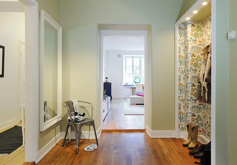
Decorating a nursery: new trends
Coverings with horizontal zoning look good in a children's space. A simple rule: wallpaper with a pronounced texture and pattern should be placed at the bottom; the upper part of the wall can be covered with plain canvases or wallpaper with the same type of images. A horizontal joint is usually decorated with borders or decorative plinths.

Wallpaper in the patchwork style on the walls of a nursery looks interesting and original. To create an imitation of a patchwork quilt, you should cut out figures from the remains of wallpaper and paste them in a certain sequence, end-to-end or overlapping.

Another idea is to glue appliqués onto a base created using pastel plain wallpaper or canvases with small patterns. Your favorite cartoon characters and fairy tale heroes can decorate the walls of the nursery. Look at the following interior design.

When arranging an apartment, special attention should first be paid to the walls. After all, they will create the basis of the interior and set the color scheme. Furniture and additional decorative elements are installed later and must be combined with the walls to make the rooms look cohesive.
Here we will not be scattered throughout the apartment, but will focus on its largest room - the living room or hall. It is in this room that you bring guests; here you can relax after work, arrange a home theater or have a tea party.


You can immediately go to the store, look at various wallpaper options and choose the best one. But this option has several disadvantages:
- your eyes will run wide from the abundance, and since you don’t know exactly what you’re looking for, it will be quite difficult to make a choice;
- wallpaper chosen in this way can completely not meeting your expectations after gluing, since the color on a roll and on the entire wall can look completely different.
Therefore, it is better to first understand a little about the combination of colors, correlate it with your preferences and choose the appropriate option, and only then go choose something suitable in a hardware store.
If you haven’t found the ornament you need in the store, here’s a master class!

How to choose wallpaper by color, contrast, pattern
First of all, you need to decide on the color scheme, and only then think about the presence of a pattern. Think about what shades you prefer: warm or cool.
- Warm will make the room more lively and bright.
- Cold– will help visually expand the room (which is especially important for Khrushchev-era apartments or other small spaces).

But in any case, you need to maintain a balance between warm and cold tones, otherwise the room may look too stuffy or very inhospitable.
- If you have well lit, If the room is sunny, tone it down a little with cool tones; if it’s cloudy, add some warmth to it.
- Also, when choosing a color, keep in mind that you will see him every day. You can choose this blouse, either light or bright, and put it on according to your mood, and store it in the closet the rest of the time. This won’t work with wallpaper, so choose not just a color that you like, but one that you won’t get tired of until the next renovation.
If you decide that one color is not enough, then you can choose several, compatible with each other.

You can combine related colors (from one or adjacent sectors of the color wheel), or contrasting ones (from diametrically opposite sectors).
TIP: If you decide to use wallpaper with a pattern - don’t overdo it, the walls shouldn’t hurt your eyes. Particular care must be taken when drawing in a small apartment x (for example, Khrushchev-era buildings), since it can visually make the room smaller, especially for large, bright patterns (large contrasting flowers and the like).
Related colors
If you are not confident in your design abilities, combining related colors (solid or similar) is the easiest way! You definitely can’t go wrong and this solution will always look stylish.


Contrasting colors
This photo is a good example of a combination of contrasting colors. There is not a very noticeable pattern here, but plain wallpaper in such a combination would look harmonious.

Ways to combine wallpaper
After becoming familiar with the basic aspects of color combinations, you need to move from theory to practice and proceed directly to choosing wallpaper. There are several ways to combine them:
- Pattern + solid color
- 2 drawings
- Geometry + one color or pattern
Whichever one you choose, the main thing is to create a harmoniously combined, pleasant interior that will satisfy your preferences and make the home truly cozy. To understand the possible options, let's look at them in more detail.


Pattern +solid color
With this combination, most often wallpaper with a pattern is applied only on one wall, and the rest are simply plain. This will help to create a certain emphasis, but will not look too colorful.
- The drawing can be from related colors to plain wallpaper, and from contrasting ones.
- A wall with a strong contrasting pattern will look similar to huge picture.
Below are interesting options for such a combination; you can choose one of them as a basis when creating a living room design.


A clearly visible floral print was used here. Please note that the furniture, rugs and cushions are selected from exactly the colors that make up the pattern.


The pattern can be either small or large, abstract or concrete.


Also note that walls with bright patterns are not loaded with decorative elements (paintings or photos); at most, a mirror should be very carefully selected. Maintain simplicity and harmony. An overloaded interior will be very tiring.


A good example of a combination of contrasting colors, since without the blue tulle the brown wallpaper would look too gloomy.

With geometric patterns
Floral prints, patterns and abstract patterns can compete with geometric elements. But you must be sure that strict lines will not oppress you and will allow you to relax.


Zigzags, diamonds, lines, ovals, circles, etc. - a wonderful choice for lovers of clarity and order. In this case, you can also try interesting color combinations.


 2 drawings
Combinations of two patterns look original and unusual. For a bedroom it would be too flashy, but for a living room, if chosen correctly, it is very good.

This photo shows both the contrast of colors and the combination of floral and geometric prints. Cool black on the lines and warm red on the petals.

Here, too, there are combinations of floral patterns with geometric ones, but in the same color scheme - related colors were used.

One of the patterns can be expressed much brighter than the other, in which case it turns out similar to the pattern + plain wallpaper option. Similar patterns made in different colors also complement each other well.

Combination methods
One wall
The easiest way to combine wallpaper. How to choose a wall? Of course, the one you most want to attract attention. Usually this is a wall near or behind the sofas in the room.

Picture or frame
If in the case of a wall completely covered with wallpaper with a pattern, it looks like a painting, then the wallpaper here is the painting. It's like a huge canvas with a printed design.


You can simply stick wallpaper of a certain size, or make a frame around the edges.
In the form of stripes
An interesting way of combining is in the form of separate stripes. For this case, it is better to choose wallpapers that are contrasting with an active pattern, as this will be the main accent!


Focus on niche
For apartments that have a niche in the living room, it’s a great option to play with contrasting wallpaper and color. It’s also a good idea to illuminate a niche with an additional source. This is especially important if the niche is far from the window.


Brief summary
To summarize, let’s remember the main points that you should pay attention to when choosing wallpaper:
- Consider the size and lighting of the room
- A color scheme
- Personal preferences.
We hope that the process of choosing wallpaper will be calm and quick for you, and the result will look amazing and delight you every day, creating real home comfort.

2 ratings, average: 4,00
out of 5)
A living room or hall is a place of rest not only for guests and acquaintances, but also for household members. Therefore, it is very important that the design and interior of this room be worked out. One solution in this case is combined wallpapering of the walls in the hall.

Advantages
It's no secret that wallpapers differ in design, color scheme, production technology and composition. The right combination of various representatives of this segment allows you to solve a number of problems.
First of all, through combination, zoning of certain zones is achieved. So, for example, in the kitchen you can separate the dining area from the working area, and in the bedroom you can separate the wall behind the headboard. Combining visually you can expand the room not only in length, but also in height. This is achieved by using wallpaper with horizontal or vertical stripes.


In addition, by focusing the attention of prying eyes on a particular wall, you can hide minor flaws in the room and uneven walls. By combining, you can highlight niches, protrusions, or, conversely, decorate them.
Often in construction stores you can find leftover wallpaper that is sold at bargain prices, including new items for 2016. If you approach this issue wisely, you can save a lot on repairs. At the same time, we can say with absolute certainty that no one else will have such a room.


The main feature of the combination is that the wallpapers do not compete with each other, but, on the contrary, complement them. In the following sections, we will consider combined wallpapers for the living room of 2 types, including the 2017 design.
By the way, it is worth noting the fact that this year oriental patterns, bright colors, stripes and monograms were popular.


Combination Features
Before you start considering the features of combining different wallpapers, it is important to know what wallpapers exist in principle. Today, manufacturers around the world produce the following wallpaper coverings:
- Paper. It would not be a great exaggeration to say that this is the most affordable building material, since it is easy to find in any hardware store and has an affordable price. Due to the fact that they are made from cellulose, an environmentally friendly material, these wallpapers can “breathe”. But like any paper, they easily become unusable due to high humidity, which means they cannot be used to cover walls in bathrooms and kitchens. They are fragile and short-lived.

- Non-woven. They are made on the basis of non-woven fabric, which, in addition to paper, also includes special fibers, thanks to which they can be painted. By the way, they can hide uneven walls, and this is very important if you don’t want to level and prime the surface during repairs. Unlike paper wallpaper, non-woven wallpaper does not leave bubbles behind. Remember that the glue must be applied to the wall - this is another feature compared to its predecessor.

- Vinyl. Depending on the technology, they can be produced on the basis of paper or non-woven fabric. The top layer is vinyl, which allows you not only to wash wallpaper rolls, but also to paint them. But remember that there are types of vinyl wallpaper for which painting is strictly prohibited. This is evidenced by the markings on the packaging. This wallpaper is UV resistant, has good durability, and is not contraindicated for allergy sufferers.

- Acrylic. This variety has not gained much popularity among buyers, which is why manufacturers are not developing this segment. In terms of cost, they can easily compete with paper ones, since both paper and acrylic ones do not tolerate high humidity.

- Textile. Experts recommend covering bedrooms with them. Due to the fact that the top layer can be velor, silk or linen, they create a luxurious interior. But, unfortunately, due to the high price tag, not everyone can afford them.

- Liquid. Many buyers are surprised why liquid wallpaper is sold in the form of dry mixtures. The thing is that they must first be prepared. Gluing liquid wallpaper is reminiscent of installing decorative plaster. There is no need to level the surface of the wall - liquid wallpaper itself does an excellent job of this task.

- Glass wallpaper. The production of wallpaper from glass fibers is reminiscent of weaving. They are durable, do not burn, and are easy to care for, including with the help of aggressive household chemicals. Another plus is that mold does not form under them and they are not inhabited by pests or microorganisms. The disadvantages include a limited number of designs, but due to their long service life, glass wallpaper is often used in office premises.

- Photo print. It is advisable to stick wallpaper with photo printing on the wall that is not covered with anything. Since paper is the base for photo wallpaper, experts recommend protecting the top layer with special compounds from moisture and ultraviolet radiation.

- Natural. They are made from natural materials, so they have an increased price. Look great in bedrooms and living rooms. But it is worth noting that they must be properly cared for, otherwise there is a high probability of damage to the product.

- Metal. They contain paper and aluminum foil, making them wear-resistant and moisture-resistant. Natural light and artificial lighting, reflected from the surface of metal wallpaper, visually expand the space.

- Cork. This is an environmentally friendly natural material. They are made from oak bark, the release of binding resins is achieved by pressing, and for durability the product is coated with special natural impregnations.

Quartz, velor, beaded, bamboo - the list goes on for a very long time. It’s impossible to list all the varieties. But it is worth remembering that combination is possible with any of the types. The main thing is to take into account their combination on different walls.
You can choose a combination of two colors based on a small rule. The main thing is that the colors are “relatives”; for example, you can paste two walls with light wallpaper, and the remaining ones with bright ones.


The combination can be horizontal. Light shades look beautiful with dark ones. This type of wall covering can visually expand the length of the space. When the combination is vertical, the room visually expands in height. Remember that transitions should be properly decorated with moldings, borders or corners.
Another variety can be called a combination of wallpaper of the same color scheme with and without a pattern. This emphasis allows you to highlight one wall or a small corner in which you can hang a TV or collectibles.


Photo wallpapers themselves attract attention, so they are very it is important to combine wallpaper with a similar color scheme. Otherwise, you can create an interior in which photo printing will be out of place. The combination of two dissimilar patterns or colors allows you to highlight a certain section of the wall.
Remember that the width in a patchwork combination should ideally match, but you can experiment with the length. The main thing is not to mix expensive collections with inexpressive stale items.


In Western countries, wallpapers in “frames” are popular - this is a kind of panel. To begin with, wallpaper rolls are pasted on all the walls, and only then, depending on the interior, “frames” are mounted either near the bed or below. Skirting boards or baguettes can serve as frames.
For non-standard rooms that have niches or projections, a combination can complement the interior. This is especially important in older homes that have a chimney or garbage disposal.


All these methods will be discussed in detail in subsequent sections.
Combination methods
Let's take a closer look at combining wallpaper within frames. Designers recommend covering the main wall with certain wallpaper, and the remaining three walls with wallpaper of a similar color scheme. After that, small rectangular pieces with a baguette are glued on the opposite side.
This highlighting with a decorative border allows you to focus attention not only on the main wall of the living room, but also on the opposite one, where there can be a relaxation area with a corner sofa.


Combination in a design environment has its own names:
- Range. This is the use of wallpaper strips of different shades, but of the same color scheme. In this case, it is not necessary to accent one wall; you can cover all four walls with different wallpapers. Experts thus play with the transitions from light to dark tones.
- Balancing. The key in this option is the central wall, which can have a complex pattern, and the remaining walls are covered with uniform wallpaper with related shades.
- Opposite color scheme. Such an aggressive combination is suitable for youth rooms, but you should approach this process with all responsibility, since choosing the wrong colors can damage your psyche.
- Material texture. When combining wallpaper with different textures, it is important that they are in the same color scheme, but have different patterns.


Contrast
By combining you can achieve certain effects. For example, you can redirect attention away from defects on the wall with a combination of two colors. If there are various wires in the room - security alarm, cable TV or Internet, then you can stick a bright strip opposite them.
In order to avoid erecting partitions from a metal frame and sheets of plasterboard, zoning can be done. This method is used in studio apartments, where it is necessary to visually separate the living room from the kitchen.


By combining pastel and dark colors, you can achieve a visual expansion of small rooms. But remember that you need to experiment with knowledge, otherwise the result may be shocking, and no one will return the money.
By highlighting a wall you can draw attention to a certain interior detail. In the hall or living room, you can highlight a relaxation area in this way.


Game of textures
Selecting combining colors and patterns is not really an easy task and there are things that you need to pay attention to.
First of all, wallpaper should be the same thickness, only with this combination can good results be achieved. The joining will be perfect and the seams will not be visible.
You should approach patterns with caution; there should not be more than two of them, and the color scheme should be of related shades. In this case, you can combine pastel shades with exotic bright ones. The surface must be prepared in advance for pasting.


Remember that before purchasing wallpaper rolls, it is advisable to attach different pieces and see how well they fit together. This way you can save money if suddenly the wallpaper doesn’t match. You can ask sales consultants to combine wallpaper; the “companions” will be immediately noticeable upon a quick inspection.
It is worth considering that the texture should be combined with paper wallpaper, textured with textured. If non-woven or vinyl wallpaper has already been chosen as the main wall, then, accordingly, related materials should be their companions.


Color spectrum
Color design can correct room lighting problems. So, for example, if the windows of the room face north, then using light colors can improve the situation. The same effect is achieved by combining dark and light shades, and do not forget about additional lighting.
Two-color solutions can brighten up minor imperfections. If there are inconspicuous niches or ledges in the living room, then designers recommend framing them with dark wallpaper, and the rest of the room with light wallpaper.


A few rules for choosing colors:
- Red. Accents of grey, green or blue will suit it as “partners”. Do not overdo it with golden, purple and brick shades. Brown and chestnut tones look good in combination with red.
- Pink. When selecting furniture, you should look out for burgundy and gray colors. Brown tone can be used in moderation. But blue and red are strictly prohibited. The same goes for turquoise.
- Orange. You can match this color with decor and furniture in green and white tones. Interior items can also be in purple tones.
- Brown. This is a classic color and goes well with blue and gold. Gray and beige can be used with caution.
- Yellow. It needs to be combined with brown or green furniture.


But remember that a selection of beige shades goes well with light wallpaper, and black colors should be avoided in rooms where there is no additional lighting.
A selection of photo wallpapers is an entirely individual process. After all, the accent wall can be of any color, and this alone should make you “dance.” If you take into account all the recommendations described above, then everything will work out.


Before you decorate a living room of standard sizes (18 sq. m), you need to develop a design project. Color schemes, furniture and lighting should be taken into account. Before going to a hardware store, you need to understand whether you should focus on niches and protrusions or, conversely, whether they should be decorated. In emergency situations, some people resort to dismantling them.
Often the furniture is already available, so you need to combine colors in the apartment based on its shades and other interior details. The color of the wallpaper rolls should either be similar to the color of the furniture, or be a little lighter.
But remember that an overabundance of bright colors can create a depressive environment in which prolonged stay in the room is fraught with negative consequences.


If you completely put the purchase of wallpaper on your shoulders, then it is important to know that you need to save batch numbers and shade colors. It is advisable that the wallpaper have one manufacturer, this guarantees a combination of at least the thickness of the product, so that seams and joints will not be visible.
Combining plain wallpaper with and without a pattern in the living room allows you to decorate even a small room. Patterns, ornaments and monograms help transform one of the walls and make it stand out from the rest.


In a narrow rectangular room, designers recommend combining wallpaper in a horizontal plane; this combination allows you to visually expand the room. Remember that in rooms with low ceilings, when covering the walls and ceiling with wallpaper, you can “stretch it out.”
By following these simple tricks, you can significantly transform a familiar interior.
For a small room you should try to choose pastel colors. The pattern can be abstract or from the field of geometry. Wallpaper with a large pattern will visually make the room smaller. Wallpaper that imitates a cut of wood goes well with flowers, narrow stripes with abstract patterns, and this also applies to cages.


Unfortunately, the lighting in a hardware store is always different from that in an apartment, which means that the wallpaper you like can look completely different in the room. This should be understood at the selection stage.
It is advisable to add the main color of the wallpaper to the decor by purchasing pillows or paintings with the desired color.
Remember that when combining paper and washable wallpaper, they will require different care. If paper wallpaper gets wet, it will become unusable and eventually fall off, which means at least cosmetic repairs will be required. It is also important to take into account the interaction of the building material with the sun's rays. If the wallpaper strips turn yellow or fade under the influence of ultraviolet radiation, they will also need to be replaced. That's why experts recommend combine paper with paper, and vinyl with vinyl.


If small children use the living room as a play area, then you should find a small corner for this purpose and stick chalk wallpaper there - you can draw on it. They are easy to care for - just wipe with a cloth.

Mass housing, created in the Soviet years and popularly referred to as “Khrushchev”, is still in operation. Its demolition only recently began in the capital of the Russian Federation, and how many more such houses were built on the territory of the former Soviet Union is a rhetorical question. Of course, you can wait until the housing is demolished and a new one is built, but for many families this is not a way out of the situation. The living room in the “Khrushchev” can be arranged in a classic, retro or Provence style.
To do this, you can implement all the previously voiced tips. By the way, wallpaper has good sound insulation and good thermal conductivity, and it follows that, in addition to design use, they will also furnish the room from a practical point of view.


To learn how to choose the right wallpaper, watch the following video.
Options in the interior
Combining different wallpaper strips allows you to hide imperfections not only on the surface of the walls, but also in the room itself. If you use plain wallpaper, against the background of curved walls, on the contrary, they will only emphasize this drawback
Using a combination, you can separate the work area from the relaxation area. If you plan to create a sleeping area in the living room, then this solution will highlight the sleeping area.
As a rule, such areas are highlighted with dark shades or special patterns.


If you combine wallpaper correctly, you can visually expand the room either in length or height. To do this, it is enough to use wallpaper with stripes or glue multi-colored canvases.
Combination allows you to beat the room in a minimalist style. All attention is paid to the wall that is covered in this way. Emphasis helps to designate the fireplace area or the wall on which the TV hangs.


In this way, you can select niches in the living room where you can place photographs that are close to your heart and expensive collections of antiques.
The patchwork combination system allows you to save a lot, since wallpaper remnants are sold at bargain prices. But this combination must be approached consciously, otherwise you will have to re-glue the wallpaper.


An accent wall looks great in living rooms designed in hi-tech or minimalist style. It is only important to choose it correctly; you should not focus on the balcony block or interior door, since most of the space is occupied not by the wall, but by the openings.
Remember that with its help only two surfaces are isolated, otherwise there is a high probability of oversaturation.
In a narrow room, preference should be given to bright colors when emphasizing small areas, and to highlight long areas with calm shades. This technique allows you to expand the living room space. Designers know very well that by combining cold and warm shades, you can achieve the desired result.


In the living room, it is best to accent the wall behind the TV or sofa. To do this, you should resort to the previously mentioned techniques, namely, a combination of dark shades on the main wall and similar colors on the remaining walls.
But in order not to delve into the basics of design, experts recommend turning your attention to modern photo wallpapers and building on them. In a horizontal combination, dark and light wallpaper companions are used. The joint is usually placed in the same plane as the door or chair; the transition is decorated with molding or a specially selected border.


Modern designers are trying to move away from the classic horizontal combination and place wallpaper strips in a way that is understandable to them.
By the way, in the upper part you can decorate the joint between the wall and the ceiling with stucco molding in the appropriate color.
Remember that the molding also performs a protective function; it is placed at the level of the back of the chairs for a reason. If the chair is moved close to the wall, then there is a high probability of damage to the wallpaper, but in this case nothing will happen to the molding.


Horizontal combination is an opportunity to combine incongruous things. Thanks to the transition, you can use wallpaper of different thicknesses. And you shouldn’t pay attention to the texture with this combination. Paper or non-woven - it doesn’t matter; you can combine vinyl wallpapers with textile ones.
 (1 ratings, on average: 5,00 out of 5)