Which sofa goes with silver wallpaper. We create an extraordinary interior against the background of gray wallpaper. Curtains for gray wallpaper
If until now the color gray has been synonymous with boredom and facelessness for you, then it’s time to change this opinion. Gray is aristocracy, elegance, subtle taste, silence, tenderness. All shades of gray have surprisingly poetic names - pearl, smoky, silver, gray-green tea, ashen. Isn’t it true that the image of an elegant French living room or an English bedroom of some high-ranking person, which is decorated with gray wallpaper in the interior, appears in your mind?
When we talk about gray, then, as in the case of beige, we mean a huge number of shades, each of which has its own mood. It can be a deep dark grey, the color of sandpaper, or a subtle silver haze on white. It must be said that the gray color, both in clothing and in interiors, went out of fashion relatively recently, in the middle of the twentieth century. And back in the 19th century, gray wallpaper was the most fashionable decoration at court.
content:
- Gray + red and blue
- Gray + yellow
- Gray + blue
- Gray + beige
- Gray wallpaper in the living room
- Gray wallpaper for the bedroom
- Gray wallpaper in the hallway
"The benefits of gray wallpaper"
Gray wallpaper is good because it can be used to correct any flaws in the interior. The right shade can neutralize all the mistakes made, such as ill-conceived and too contrasting colors of furniture, textiles and accessories. The right ones are able to reconcile them among themselves, making them sound quieter and more noble.
Always remember that gray itself is neutral, but proximity to any other color gives it a shade that is complementary to that color. That is, if you place yellow furniture next to a wall with gray wallpaper, the wall will appear slightly purple. If you perform the same maneuver with blue furniture, the gray color will appear warm, with hints of orange.
Finally, gray is a lifesaver for those who would like to see their home as neutral or brutal as possible, but do not dare to paint it. Even the richest shade of gray, such as anthracite, does not look as dark and dominant as black.
“The most spectacular combinations with gray wallpaper”
Although gray color adapts to any other, we must remember that those same “others” can lose all their charm against its background. To prevent this from happening, turn to time-tested color palette, with which your interior will look as stylish as possible.
"Grey + red and blue"
- If your decor is based on bright furniture, and even with a colorful small print, gray wallpaper will be the ideal background, bringing the design to a balance that is comfortable for you. Gray wallpaper should be selected depending on the purity of the main color. If red, blue and orange are pure, then gray should be rich and ringing. If the situation is as in the photo below, that is, the colors are muted and dirty, gray should be chosen with the addition of beige. By the way, pay attention - a light print on gray wallpaper is not a hindrance to harmony!

"Gray + yellow"
- This is one of the most interesting and unusual combinations, which few people dare to use at home. Many believe that it belongs to the category of alarming, but in reality, right choice wallpaper gray plays a decisive role in this interior. Remember, just above we mentioned that near yellow, gray begins to glow lilac? Make his task easier by choosing the lightest and airiest shade possible.

"Grey + blue"
- In terms of their emotional message, these two colors can be similar. Quite soft, soothing, uncomplicated, which can be safely combined in one drawing, as was done in the photo below. All that remains is to choose the appropriate accessories or add a few more to the interior pastel shades, here these are pink pillows.

"Grey + beige"
- Instead of beige, you can safely substitute creamy, coffee with milk, caramel, and so on. With delicate pastels, gray wallpaper will always look good. To keep this mix from looking too boring, fill it with small details, such as an interesting pattern on the wallpaper, like in the following photo.

“Grey wallpaper in a monochrome interior”
In this case, we will not talk about any monochrome, but just about shades of gray, diluted with black and white. Now, when avalanches of visual information fall on us every day, sometimes we want to come home and plunge into an unclouded neutral space. Good news for gray lovers – there are a million design options! And special design skills are unlikely to be required, since working in one range is much easier than dealing with a huge color palette.
- Maintaining the entire interior in gray is a fairly simple task if you limit yourself to only light shades. In this case, gray wallpaper should match everything - whitened, translucent, and always smooth, with a slight glossy sheen. Pink accentuates gray amazingly beautifully, so any large accessory of this color will look elegant.

If you are strict in terms of accessories and do not allow anything bright in your achromatic design, but want to liven it up, choose gray wallpaper with a pattern. Moreover, there is no need to compromise here - the drawing can also be black or gray! Let's look at the examples and choose the option that suits you!
- Interior design in Swedish - white floor, white ceiling, white walls... and one contrasting one! – this is very Scandinavian, and it doesn’t have to be a bright contrast. According to the principle of discreet minimalism, we choose light gray wallpaper with an eco-pattern and feel like in a studio apartment, lost in the streets of Stockholm.

- And in this illustration we see a more respectable option, where shades of gray wallpaper are represented by graphite, lead, lavender and lilac, thickly mixed with black. This is also minimalism, but of a different kind, clearly hinting at the high status of the owner of the house. The pattern on the wallpaper is no longer modern, but classic, large pale yellow flowers.

“Gray wallpaper in an apartment: examples”
And finally, we will show you some examples with wallpaper in shades of gray in different rooms– in the living room, bedroom and hallway. We discuss interesting and unique ideas, and then take note of them!
"Gray wallpaper in the living room"
- Our choice is alternating colors! alternate with gray ones, and in the center of the room we make bright accent where these colors are combined - a wide strip of wallpaper with a pattern. It looks trendy and not flashy. Shades of chocolate, wood and cognac, as in the photo below, will help make the room warmer and more comfortable.

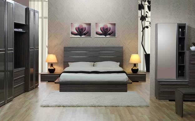
"Gray wallpaper for the bedroom"
- Dark gray and light gray have an equally good calming effect, so it’s up to you which one to choose. We offer you a dark shade of gray, through which purple seems to break through - it is emotionally pleasant and not boring. And when good lighting Gray wallpaper in this interior will give off a blue tint.

"Gray wallpaper in the hallway"
- And finally, the gray hallway. This design will look unprofitable in tiny hallways and corridors, but if their area is at least slightly larger than average, this is your chance! The combination rules are the same as those mentioned above to create a strict and classic interior fill the room with black, white and beige accessories.

Interesting solution When decorating the walls, use gray wallpaper. In our minds, the word “gray” is usually associated with boredom and inconspicuousness. However, designers all over the world willingly use this color to create the most unusual images and interiors. What is the mystery of gray and how to use it when decorating a room in such a way as to create the desired mood?
What is the beauty of gray wallpaper?
Gray color is close to white and black. But, unlike them, it is softer, and also has countless shades. They can be matched to both warm and cool colors.

Walls of this color can become a backdrop for interior items or play a decisive role in the perception of the room - it all depends on personal preferences. In the first case, use soft, light shades(pearl, smoky), in the second they opt for rich colors - silver, steel, with a blue or bluish tint.

Psychologically, gray color relaxes, instills a feeling of stability and peace. It smoothes out bright color accents, but at the same time sets off other colors favorably.
Overall gray - cool color. Decorating the walls in light gray tones will make the room more spacious, visually push back the boundaries of perception, and create a feeling of coolness.
The main advantages of gray color:
- unobtrusiveness;
- elegance;
- variety of shades;
- excellent compatibility;
- expansion of space.
At the same time, when using wallpaper of this shade, it is easy to go to extremes and ruin the room, making it boring, expressionless or gloomy.

Common Mistakes
When using gray color, take into account the following nuances.
- A dark gray shade will make the room gloomy and depressing. This color should be used in doses, just like black.
- If the chosen shade looks too boring, choose wallpaper with a pattern or an interesting texture.
- Gray is the color of severity and elegance. Frivolous flowers, frills and other intricacies do not suit it. Use geometric or graceful floral and abstract solutions when selecting accessories and patterns.
- Light gray wallpaper is used to create a background to make interior items look richer and more attractive.
- If you plan to create a calm and relaxing atmosphere in the room, wallpaper can be used as an independent color scheme for the walls. At the same time, they stop at shades of medium intensity - not too light and not too dark, observing the rule of the golden mean. It is better to use patterned coverings or companion wallpaper.
- Matte wallpapers are better suited for creating a background, glossy wallpapers are better for highlighting walls.
- For living spaces - bedrooms, children's rooms - it is better to choose soft, warm colors. If you are decorating the walls in the living room or office, then dark shades will help create a strict and formal interior that will not distract from work and communication.

As already mentioned, gray color can be used in two ways: to create an interior in strict monochrome colors or as a background emphasizing the main design decisions.

Interior in gray tones
To create a strict office environment or relaxing, soothing interiors, designers often use all shades of gray. The principle here is the same as when creating black and white interiors. The difference is that the "gray style" is softer and easier to create. harmonious combinations.

For walls, use wallpaper with an interesting texture or with a relief pattern.
A large drawing visually brings the wall closer, a small one moves it away. Therefore, wallpaper with small patterns is recommended for small rooms.

The color should be quite expressive. If the wallpaper is light, then it is emphasized with a glossy pattern. Furniture can be either light gray, almost white, or dark or close to black. To create soft, calm interiors, use delicate shades - for example, pearl wallpaper and gray furniture with a brownish tint. To make the room more severe, use pure cool colors: silver, steel, gray with a blue tint.

Here are some examples of how you can use gray wallpaper in the interior of different rooms.
- Living room . In small rooms, wallpaper in light, cool tones is chosen for covering walls. It is better if they have a discreet geometric pattern. One wall can be decorated with companion wallpaper of a darker color. Massive furniture - a sofa, cabinets - is chosen several shades lighter, almost white. For contrast, place two or three dark gray objects in the room - coffee table, TV, chair. You can put a carpet with a brownish tint on the floor. If the room seems too boring, complement the interior sofa cushions several shades darker than the carpet, or the color of the chair. For big ones living rooms are suitable darker furniture, retro wallpaper or newspaper print on one of the walls.
- Bedroom . For those who like bright bedrooms, we recommend plain pearl wallpaper with companion wallpaper at the head of the bed. The furniture can be several shades darker than the main wallpaper, and the blanket or bedspread can be light. For those who feel more comfortable in a dimly lit bedroom, we can recommend gray wallpaper with a brownish tint, a dark carpet, a dark gray bedspread and lighter furniture.
- Kitchen . Gray color in the kitchen creates a feeling of cleanliness and radiance. Kitchen sets steel or silver color with many chrome parts have long been loved by housewives. Wallpaper in bluish or neutral tones and a dark gray floor will help highlight them. The options look very nice when the walls and floor are made in the same color scheme. In this case, contrast is needed - a table that differs in gray intensity, bright chairs, kitchen items.
- Bathroom . This room is made in delicate or silver shades. White bath and the sink will be a good contrast to the walls and floor, which can be made of tiles with a stone pattern or tiles. To create a highlight, you can use an interesting mirror frame or an artsy lighting source.
- Hallway . Due to its small size, gray color in its pure form is practically not used in the hallway. The wallpaper should be light enough so as not to create the feeling of a closet. Be sure to dilute them with glossy surfaces or warm light colors of doors, mirrors, light wood floors, stretch ceiling With big amount lamps. To highlight one of the walls, you can hang pictures with bright colored patterns on it.

In a nursery, gray looks a bit boring, unless used as a background. Let's consider which shades go best with gray and how the best way apply its ability to shade other colors.

Gray walls as background
Neutral gray goes well with almost all shades. Let's highlight the most interesting pairs.
- Purple or lilac. The number of such items should be limited, otherwise the room will look tasteless. The brighter purple, the darker the wallpaper on the walls should be.
- Pink . This combination is appropriate in children's rooms and romantic bedrooms.
- Blue . This tandem can look too cold, so it is livened up with small accessories in warm colors or interesting patterns.
- Yellow . A very cheerful combination, but there should be less yellow than gray. The wallpaper is chosen in a rich color with a hint of steel. This pair looks great in the kitchen.
- Red and orange also needs to be used in doses. In order not to overdo it with the brightness of the color, some red items can be replaced with beige ones. Red and beige in combination with platinum-colored wallpaper are suitable for living room interiors.

Gray can be combined with brown, but here you need to carefully select shades. Light gray color will complement all the tones of light wood, and taupe goes well with rich red furniture.

Choosing furniture
Furniture for gray wallpaper is selected based on the following rules.
- Objects with cool shades will go well with wallpaper. glass surfaces and chrome parts.
- The color of the furniture should differ from the color of the wallpaper by several tones in one direction or another.
- Natural wood is quite difficult to combine harmoniously with gray walls. You need to carefully select the shade of the wallpaper: it should be quite light, with brownish tones. A wooden floor or a brownish carpet reconciles walls and furniture. The use of wood in the interior significantly softens the gray tones.
- A classic combination is gray walls and white or black furniture. This interior looks very strict, so it is more appropriate in offices and living rooms.

Theoretically, the furniture can be of any color, but it is necessary to choose the appropriate shade of the walls. Items bright colors there should not be too much, otherwise the charm and elegance of gray wallpaper will be completely lost.

How to choose curtains?
What curtains go with gray wallpaper? There are several options, and they all depend on how bright you want the room to be.
- In rooms where you want to create a calm, relaxing environment, it is better to use curtains of a neutral color - white, light gray, soft silver. To highlight the window opening a little, curtains can be sewn from satin or brocade fabric with a shimmer. When decorating a room with purple or purple furniture pink flowers the same shades can be applied to the curtains, but make them pastel.
- To create strict monochrome interiors, black and white curtains or steel-colored drapes are suitable.
- Curtains of bright colors - red, burgundy, orange, yellow - can be used in small rooms as the only color accent in combination with figurines, decorative vases, pillows and similar little things. IN large rooms bright curtains can complement a sofa or armchair of the same color.
- If the curtains are bright or dark colors, then it is better to choose a fabric without a pattern - this is required by strict gray walls. IN bright interiors curtains can have a small or large pattern, but it should not be too prominent.

Also comply general rule: Curtains should not blend into the walls. With the same color, they can be several tones darker or lighter than the wallpaper.

Little tricks
A non-standard solution would be to cover the walls with stripes different colors. For example, a combination of gray and pink will create an interesting tandem. In this case, one wall can be decorated with companion wallpaper with a large pattern of the same colors. By skillfully repeating them in furnishings, you can get a very nice room - bright and at the same time calming. Curtains for such a room are chosen in plain colors, gray or pink, and furniture - in contrast to the color of the curtains.

And finally, some more useful tips.
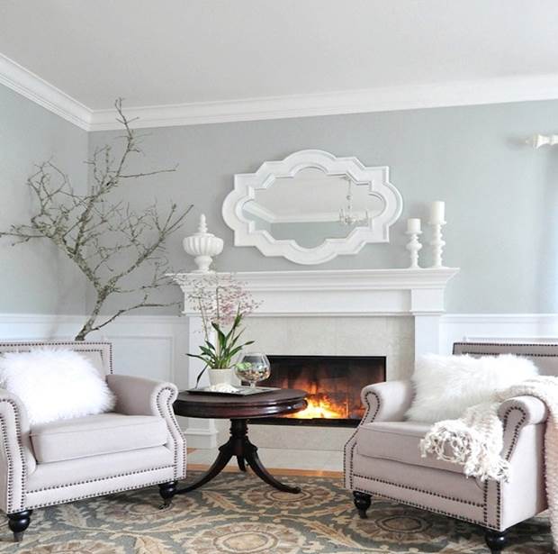
- Gray color goes well with decorative stone, imitation brick, ceramic tiles. This combination is used in bathrooms, hallways, and living rooms with a fireplace.
- A gray background is perfect for implementing a fashionable idea - large flowers covering the entire wall. It will delicately highlight the main pattern and smooth out the contrasts.
- Black accessories in a gray room will add rigor and officiality.
- Pure white accessories in gray interiors look unnatural. Preference is given to dusty white tones.

So, the gray color of the walls is the ideal background for implementing almost any design solutions. It will perfectly highlight interior items and at the same time smooth out unnecessary contrasts, and to match it elegant curtains won't be difficult. Having a soft and calming effect on the psyche, gray wallpaper will be appropriate both in the bedroom and in living rooms.

Wallpaper of this color takes a leading position among finishing materials recent years. Moreover, various variations of gray are successfully used in both classic and modern interiors. Many world-famous designers paid attention to its rich palette.
Features of gray wall design

The popularity of gray in the last couple of years is due to its versatility. It can influence the mood of the interior, independently create a calm, relaxing environment, or emphasize the brightness of other shades. It’s not for nothing that it migrated from the office version to houses and apartments. At the height of fashion, wallpaper in the colors “wet asphalt”, “lead”, and ash. Silver wallpaper also proved to be very popular (see photo below):

It’s difficult to find a shade in the color palette that doesn’t go with it, and this is another advantage of gray (photo):

This variety allows you to choose the color of the wallpaper, based on many conditions - the size of the room, darkness, its functional qualities and one of important criteria- your taste. You can leave a monochromatic color scheme.


But it is possible to dilute it with both pastel and bright colors.


When choosing gray color for wall design as a main or secondary color, you can take advantage of the fact that it looks great on large areas. If you need to be careful with bright yellow or purple, then it is simply impossible to overdo it with gray.
The right shade will be good in the design of any room, be it a bedroom, living room or children's room. And using this color to decorate the hallway is an ideal solution:

Calm, deep shades of gray can immediately seem harsh and rough. But modern designers have long moved away from such stereotypes and embody wonderful interior ideas based on these tones.
A gray bedroom can be fashionable and at the same time cozy (photo):
A living room, the walls of which are decorated with gray wallpaper, often becomes a favorite place for receiving guests and spending family evenings:

And even from the baby’s room, with correct selection shade and additional accents will emanate tenderness and warmth:

If we define the color gray, it represents nobility and elegance. It has depth, mystery and unobtrusiveness.
But designers value it not only for these qualities; the gray palette is a variety of neutral and universal tones, which means you can use any combination. It is able to enhance brightness and emphasize the delicacy of light colors.
What rules should you rely on so that the combination of wallpaper turns out harmonious, and what combinations are not the best option for decoration of certain premises? There are many nuances, it’s worth taking a closer look at the variations.
How to combine gray wallpaper correctly
Almost all neutral shades can be a good backdrop for rich, vibrant tones. But gray also has disadvantages in this sense - if accessories or finishing materials are too bright and flashy, it will enhance their expression. Therefore, experts recommend not to get carried away with extreme colors when combining with gray wallpaper Even one or two bright spots against its background can “revive” the interior and at the same time look very harmonious:
It is also important to decide on the style of the intended interior and choose the appropriate tone. If you take it at random, the result may not please you - a dark gray, earthy color in some cases makes the room gloomy, and a too pale, blurry tone makes it boring and faceless. To avoid this, you should take advantage of the experience of professionals. When choosing gray wallpaper, they are based on two combination options:
- Any light pastel, muted tone goes well with gray and is a great addition to the design.
You can give an example of combining pastel pink and light gray wallpaper. The bedroom turned out to be very cozy (photo):

Pastel shades give the room lightness and serenity. This is an excellent option for designing a place to relax and sleep - a bedroom.
Pastel smoothes out its severity and asceticism, making it more homely and cozy: (photo)

- Combination of bright shades.
A more risky option, where gray wallpaper and interior items can be the basis or “soothe” of intense shades. In this case, you can get an overly catchy composition, but with a balanced approach, the apartment will become a standard of style and taste.
Various combinations of gray in the interior
Design ideas There’s a lot about wall decor with gray wallpaper, sometimes it’s so incredible that it evokes a wide variety of emotions. But it’s not always worth following fashion or trying to experiment at random.
Taupe interior
Combining shades that are close to each other in the palette is a difficult task, since in this case the colors can merge into one spot. But when combining brown and gray, the latter color can simply “get lost”, losing its expressiveness. In this case, it is not recommended to use contrasts.

The combination of light gray and dark brown tones turns out to be calm, sometimes even very calm. The shades absorb each other, the interior can turn out boring. You can correct the situation by using several shades of brown simultaneously in the design of the room. This color combination can be very interesting:

Adding white accents to gray wallpaper and brown will also help get rid of the dullness of the interior. They will add light and airiness to the room (photo):

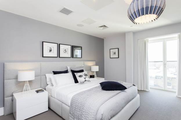
Gray and white in one interior
Modern designers quite often resort to such a combination. However, the character of the interior depends on what shade is used. Light gray tone wallpaper in a duet emphasizes the whiteness of the companion color. This combination makes the room more spacious and bright:
Dark gray is contrasting:


This combination is suitable for both large and small rooms. A kitchen in this color will look very neat:
A small living room, as in the photo, will visually expand.

If it seems that in such color combination If something is missing, you can always dilute the interior with furniture or accessories of a different color.

They fit perfectly into the gray-white design of the plant, their natural richness looks quite natural:

Gray wallpaper combined with a blue palette
Gray and blue wallpapers harmonize perfectly, however, they depend on the saturation of the shades.
The combination with rich blue and turquoise may seem very strict and even rude. This interior exudes strength and masculinity:

But, on the other hand, such an interior cannot be called familiar and monotonous; individuality is felt in it.

If you want to make a more feminine interior, preserving the color scheme and intense blues, then you can use wallpaper with a floral print or ornament in the design. This will add softness:

A completely different effect is obtained if the gray wallpaper is accompanied by a light blue color:

Two light colors create a fresh, cool interior, to which home accessories will add coziness - pillows or panels with embroidery, ruffles on curtains and bedspreads, floral decor.
Gray and blue wallpaper in shades of equal intensity create an even, calm atmosphere.


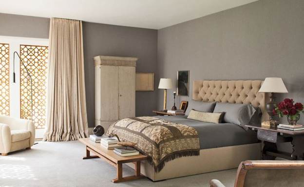
Gray and beige for decoration
An excellent option for lovers of stability and tranquility. The combination of two noble shades is perfect for an elegant, seasoned interior of living rooms, bedrooms, offices and even a bathroom:

I am not pretentious, these colors on the wallpaper will not drown out and will be able to emphasize the advantages of luxurious things - furniture made from rare woods, antique jewelry, beautiful upholstery, accessories self made:


Gray-green interior
The combination of light gray wallpaper and green shades according to all canons should be unsuccessful, since two neutral colors look fresh. However, the calmness of the base tone allows green to look light and fresh:


Not everyone is ready to choose gray and blue wallpaper in the interior. Some property owners think that such shades will bring darkness into the room, depriving it of home comfort and coziness. To some homeowners, gray wallpaper in the interior seems to be a manifestation of the “official” style, inappropriate in a home environment.
The photo shows light blue silver wallpaper that will add home interior true harmony and comfort.
Attention! The selection of gray wallpaper in an urban interior and additional shades will allow you to create a complete and harmonious image.

Choosing the right accents and additional accessories allows you to achieve the desired goal.
Design options for curtains
Professional interior designers are convinced that they help to emphasize the exclusivity and individuality of the residential space being designed, regardless of its original dimensions.

Advice! To make the gray wallpaper used in the interior look appropriate and harmonious, it is important to choose the right accents and choose accessories.
Any small detail should be thought out in the room for which light gray wallpaper is chosen in the interior. Color shade involves finding a balance between bright and pretty delicate flowers, which is complemented by a gray background. There is no need to have special design skills to bring any unusual ideas into reality.

Advice! By looking at the websites of interior specialists, you can choose best option for your home or apartment, using silver wallpaper in the interior (you see the photo below).
How to saturate the interior with bright colors
Let's talk about how to choose details for decoration, if used dark gray wallpaper in the interior. Various shades of gray are perceived by professionals in completely different ways. It all depends on the degree of illumination of the room, as well as on the presence of additional shades. For example, we note that gray wallpaper can be complemented with bright textiles.

Advice! An interesting solution would be to combine silver with other tones and shades.
If you choose matte silver wallpaper with large black flowers, you can create an accent on one wall, while maintaining a strict and restrained overall style.
Light blue wallpaper (option shown in the photo) goes well with dark shades. Dark blue canvases can be complemented with pastel shades.

Advice! In order to understand whether it is possible to combine light gray with other tones, you need to pay attention to Special attention on the brightness of the selected shade.
Dark gray wallpaper in the interior (photo below) is recommended by professionals to be “diluted” with light shades.
Attention! It is not advisable to complement light gray canvases with dark and gloomy colors.

Fragments of brown, blue, burgundy, black colors can be used as minor patterns, otherwise silver-colored wallpaper in the interior (pictured) will make the room insufficiently lit and “steal” square meters.

Interesting tips on how to correctly combine light gray wallpaper in the interior, photo finished interiors, can be found in the video fragment
What goes with light gray
Let's try to identify win-win options for combining gray (pictured) with other colors when combining several finishing materials for walls.

Let's start with the traditional palette, represented by black and white tones. Matte silver wallpaper will fit perfectly in such a situation. Considering that the resulting result will be too mundane, devoid of luxury and pathos, professional designers advise adding additional shades to this combination.

For example, gray wallpaper can be chosen with a small geometric pattern to created interior was appropriate not only for minimalism, but also for classical style. The photo shows a combination of white, gray, black colors in modern interior. Such a tandem would be appropriate in work rooms and hallways.

Gray materials (pictured) look harmonious with white stripes, colors, and patterns. Similar option combinations will do to recreate an ancient (classical) interior.
If you bring red or purple tones, combining them with gray colors will make the interior more emotional and lively.

Attention! You should not overload the created residential interior with gray tones; you can limit yourself to minor inserts.
Pink elements in gray (pictured) will help create a harmonious and romantic atmosphere. Psychologists are convinced that it is the combination of pink and gray that allows a person to tune in to relaxation and rest. That is why such a tandem of colors can be used when decorating the interior of a living room or bedroom.

It is better to choose light pink shades, in which case the room will not look dull and faded. If you decide to give your preference to decorative materials with intricate patterns, you can take gray canvases with green and pink flowers. This option will help you bring freshness to the created design and emphasize the taste of the owner of the room.
Gray-blue canvases in the interior are suitable for those homeowners who do not like bright furnishings.

By combining soft blue tones with a gray background, you can enjoy a harmonious contrast. The room will be filled with lightness, freshness, and some mystery.
Choice decorative materials for gray walls with orange or yellow elements allows you to make the room more emotional, rich in vital energy. Combinations of this kind are mainly used when decorating living rooms, kitchen premises, since the combination of such tones stimulates the appearance of additional appetite.

Silver and gray wallpaper chosen for decorating the room can be complemented with green, golden, olive, and brown colors.
Advice! When choosing such a palette, it is advisable to use a beige or white tone as an auxiliary color.
When choosing furniture for a room decorated with gray wallpaper, other details must be taken into account. For example, for a cool gray shade, white is suitable furniture set. If wooden furniture predominates in the interior, it is advisable to choose light shades. In this case, you can bring freshness into the room and eliminate the excessive coldness of the gray tone.

For modern design, interior design professionals advise purchasing glossy furniture, having milky and white facades.
It is also necessary to remember that the color of additional accessories and textiles should be selected taking into account the furniture and wallpaper. Depending on the taste preferences, you can think about the design of window openings, the color of pillows for the sofa, armchairs. Gray plain walls rooms can be complemented with bright patterned textiles.

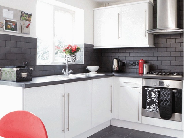
Kitchen design option
If you decide to try gray wallpaper as the main option for wall decoration, do not forget that you need to take into account the degree of illumination sunlight of this room. For example, in dark kitchen Gray canvases with large patterns will be inappropriate; they will make the room narrower. In order to avoid getting a gloomy room, you need to choose soft pink, green, and yellow inserts for the walls in the kitchen. They will make it possible to zone the space and make the kitchen spacious and bright.

If desired, you can use patterned wall coverings to highlight this room. dining area. For example, a combination of gray wallpaper with large and bright colors. To create a complete harmonious image, you can choose a pattern on the curtains to match the pattern used to decorate the walls.

It is better to choose light furniture for the kitchen in order to maximize the expansion of this room. In a kitchen with gray walls, green, red, and yellow accents look great. They bring life and harmony into the room.

Bedroom in dark colors
In the bedroom, light gray wallpaper has a harmonious look. They help you relax after a hard day at work. If you complement the gray tone with light pink shades, in this case, the interior will be conducive to philosophical thoughts and will become a real “shelter” for its owner.
Attention! Dark gray tone is only suitable for decoration bedside area. Otherwise, the room will have a gloomy appearance, and it will be impossible to rest and relax in it after a difficult day at work.

For a spacious bedroom you can purchase coverings with large ornaments and designs. For example, grayish canvases with lines, colors, prints, geometric shapes, abstract images.

Conclusion
A dark color with the correct selection of additional shades and accessories will become excellent option for decorating living rooms, corridors, offices. Professionals advise not to limit yourself to such tones, but to “dilute” them with soft shades, softening the roughness of the tone, bringing a soft, homely atmosphere into the room.
Wallpaper is the main background of the interior of our room, and what color it is and what pattern or design is on it, we base it on when choosing furniture, curtains and accessories for the room. It is necessary to select everything so that it matches the main background and repeats color scheme in the little things. Only in this way will the interior be harmonious and nothing in it will irritate.

It has long been known that colors greatly influence a person’s mental and emotional state. The mood and well-being of the person in it depends on what color predominates in the room.
Let's look at the influence of some of the most common colors and shades:
- White– the color of purity and order. Balances and sets you up for positivity. When there is an excess, it brings boredom and depresses.
- Grey– the color of neutrality. Calms and relaxes. When in excess, it depresses, brings despondency and depression.
- Black– the color of mystery. Gives a feeling of security and self-esteem. Affects the volume of the room. When in excess, it depresses and creates pressure.
- Blue- the color of the sea. Calms and relieves tension. Affects the volume of the room. If there is an excess, it puts a negative pressure on your well-being.
- Green- the color of nature. Calms, relaxes and lifts your spirits. An excess of bright green may cause a feeling of anxiety.
- Yellow- the color of summer. Lifts your mood and promotes productivity. An excess of bright yellow can cause anxiety and overexcitement.
- Orange- the color of the sun. Raises mood and appetite, gives a feeling of warmth. When there is an excess, overexcitement appears.
- Red– the color of passion. Gives a charge of activity and excitement. If in excess, it can cause aggression and anger.
- Brown– color of stability. Gives a feeling of stability and nobility, calms and relaxes. If there is an excess of dark shades, it reduces the space.
Important! Light colors and shades make the room visually larger, dark ones, on the contrary, make it smaller.
Color combinations

To correctly choose the color of furniture to match the color of the wallpaper, you need to know the combinations of colors and shades.
White goes with all colors and shades, an ideal combination with:
- Blue.
- Orekhov.
- Brown.
Gray is also a universal color, but goes better with:
- Black.
- Red.
- Blue.
- Orange.
Black goes well with colors such as:
- White.
- Grey.
- Red.
Blue and its light shades are combined with:
- Bordov.
- Orange.
- Yellow.
- Blue.
- White.
Green goes well with colors such as:
- Yellow.
- Orange.
- Brown.
- White.
- Grey.
- Violet.
Yellow goes well with:
- Violet.
- Blue.
- Brown.
- Dark red.
- Black.
Red, his dark shades combined with light shades:
- Green.
- Blue.
- Beige.
- White.
- Gray.
Brown goes well with:
- Green.
- Blue.
- Red.
- Brown.
Advice! Colors considered warm should be used in a room facing north, and cool colors in a south-facing room.
Wallpaper and furniture

When choosing furniture for a room, you need to consider:
- The combination of colors throughout the interior of the room.
- Color combination of furniture and wallpaper.
- Large or small room.
- How well it is lit.
- The functionality of this room.
- Tastes of all family members.
- Room interior style.
Interior color scheme

When choosing furniture for a separate room, of course, we first of all take into account the color of the wallpaper, since they are the background of the entire room and interior.
Of course, when choosing the color of furniture, we will take into account the combination of colors; let’s look at a few examples:
- White furniture is very versatile, as it matches any wallpaper color. It’s more difficult if the furniture is green and what wallpaper to choose, that’s the question. Using a combination of colors, furniture of this color will be appropriate if the wallpaper is white, brown, orange or yellow.
- Walnut furniture is common and what wallpaper to choose for it is not very difficult, since this color is also universal, that is, it can be combined with all colors and shades. Black furniture looks good against white wallpaper, but this is for... modern styles interior
- It is more difficult with furniture of dark colors and shades, since it is undesirable for there to be a sharp contrast between the wallpaper and the furniture, although for brave people it will look original and stylish. Designers advise choosing dark furniture, if the wallpaper is of bright colors and shades.
- Any color of furniture will suit yellow wallpaper, blue, olive, lilac and other light and calm colors and shades. It could even be multi-colored furniture, which often happens when choosing upholstered furniture. You can emphasize the color of the wallpaper using decorative pillows the same color or shade as the walls.
Selecting furniture

Many people think that choosing furniture is not a problem at all; they go to the store and buy what they like. But at home it turns out that the sofa or chest of drawers doesn’t look right at all and looks out of place in the room. And then it turns out that it’s not at all what you wanted, and there’s not enough storage space, and it’s the wrong shade, and the wrong color.
To prevent this from happening, you need to decide in advance what you want to get in the end. This is a harmonious interior of the room, this is a lot of storage space, this is convenience, or all three. Let's take everything in order.
Selection by functionality

Before going to the furniture store, let's think about what exactly we need for our room:
- What kind of furniture will be in this room. For example, if this is a bedroom, then, of course, there is a bed, a wardrobe and a dressing table.
- How much storage space will this room need? For example, if you have a lot of books, you need to estimate how many shelves you will need for them.
- What kind of sleeping places will be located here and will they fit? For example, will a double bed fit in the room and will there be room for something else.
- Worth thinking about multifunctional furniture. For example, in the living room a pull-out sofa can become a sleeping place for guests.
Important! When choosing furniture, it is necessary to take into account the tastes and desires of all family members.
Choice by interior style

If you have already clearly decided on the interior style of the room, then you should select furniture to match it.
To do this, you can use the catalog or our tips:
- For high-tech style and other modern interior styles, choose furniture without decoration, possibly made of glass, with chrome-plated and shiny legs and handles. Cushioned furniture should be straight in shape with plain upholstery.
- For classic styles Furniture with carved inserts and facades is suitable, always made of wood. Upholstered furniture with rounded shapes and gracefully curved legs and armrests. The colors for such styles are usually selected in calm colors and shades.
- For rustic styles, for example, country or Provence, will suit both wooden furniture, and forged, light colors, a little aged. Upholstered furniture in such an interior involves a lot of ruffles and frills, the colors are usually stripes, checks or flowers.
- For Japanese or Chinese styles Bamboo furniture works well, but it can be simply dark or even black with strict shapes without any decor or very minimal. It is best to choose varnished surfaces so that their shine emphasizes the severity of the style.
- Furniture in dark colors with curved shapes and numerous carvings and paintings is suitable for the Moroccan style. Upholstered furniture in rich bright colors with patterns and embroidery.
- For ethnic styles, dark, strict furniture with bright colors and patterns corresponding to the style is suitable.
Advice! When going to the store, stock up on photographs of the pieces of furniture you like, show them to the sales consultant and he will be able to understand what exactly interests you and offer only what you need.
How to arrange furniture correctly

Having decided what kind of furniture will be in the room, you need to immediately understand where and how it will stand.
For this:
- Look around and imagine where and what will stand, so you will understand what furniture will fit in the room and what will not.
- Measure the places where the piece of furniture will stand, so you will understand how busy the space of the room will be.
- Mark the places where there will be shelves or wall cabinets, so you will understand whether they will interfere or spoil the overall picture of the room.
- By using masking tape highlight the location of the sofa, armchairs or bed on the floor. This way you will understand whether there is enough space for passage.
- Use a computer program to simulate future interior, so you will understand what your future room will look like.
- A designer can do all this if you are willing to pay, but his services are quite expensive and it is not a fact that you will like the result.
Important! Each room has its own emphasis on certain furniture, for example, in the living room there is a sofa, in the bedroom there is a bed, so you need to start from this piece of furniture, both when purchasing other items and when arranging them.
Conclusion

Now you know how to match wallpaper to furniture and vice versa. Don't be afraid to experiment and choose unusual color solutions. The main thing to remember is that in order to combine the entire interior and design of the room, all the colors and shades present in the wallpaper and furniture must be present in small details or textiles.
The video provides instructions on how to create a harmonious room interior with your own hands.
 (1 ratings, on average: 5,00 out of 5)

